Number of Fatalities due to Airplane Crashes per Day
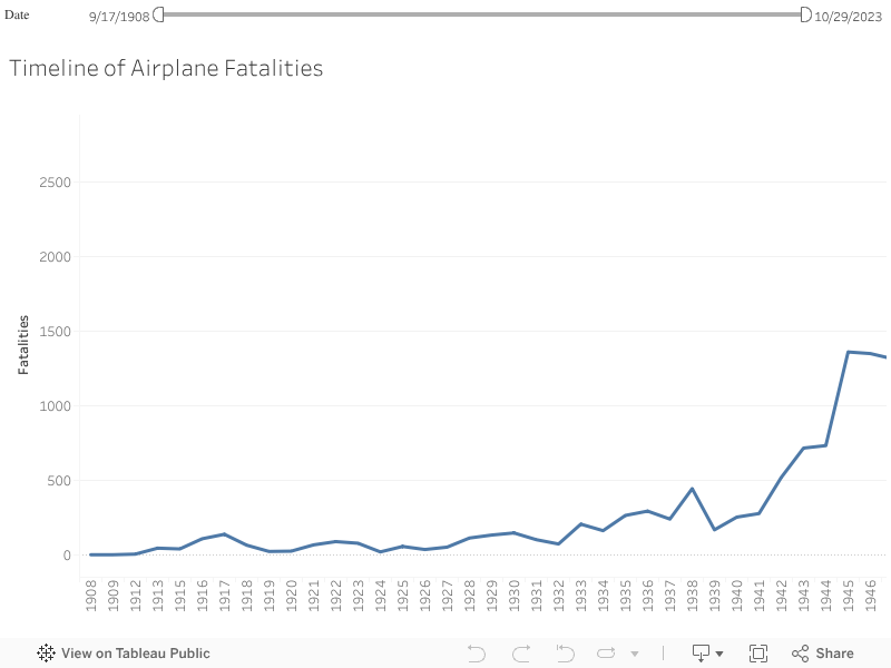
This visualization is a line graph containing information about the number of fatalities in airplane crashes from 1908 to 2023. We can observe the trend of fatalities by using the above graph. We can see that the number of fatalities is low till 1940 and then we see a spike in the number of cases. We can analyze the trend of fatalities across the years provided and the area of interest for is during the pandemic. By hovering over the graph, we can get the number of fatalities in each year, for example in 1945 the number of fatalities are 1360.