No.of Accidents vs Covid positive rate
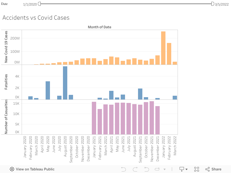
This visualization is a multi bar chart where each color represents a number from each dataset. The purple color represents the number of causalities in road accidents, blue color represents the number of fatalities in airplane crashes and the orange color represents the number of new covid cases. This graph is necessary to compare the correlation between number of new covid cases and number of deaths due to road and plane accidents. For each month, we can observe the trend and gain insights. Here the values are fluctuating and no particular pattern can be observed in the timeline we have. By hovering over the graph, we can get the exact numbers.