Life Expectancy by Continent
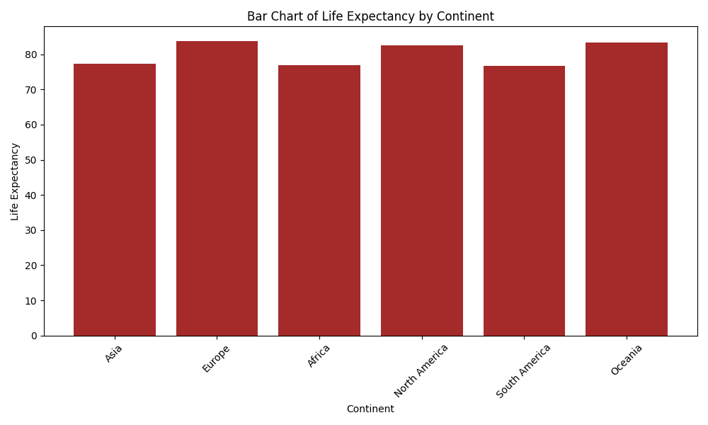
This visualization is a bar graph which represents the life expectancy in each continent. Life expectancy represents the average number of years of a person in a certain area or continent in this graph. From the graph, we can see that the life expectancy is greater for Europe, North America, Oceania than Asia, Africa and South America.